With the arrival of spring, we all want big changes. The Mediacube team is always in favor of innovation and is eager to go hand in hand with progress and new technological solutions. Therefore, we are delighted to present you a truly GRANDIOSE update of MC Pay.
In this post, you will learn about:
And other incredible changes that make MC Pay a 100% user-friendly app. All in all, let’s talk about all the improvements in order.
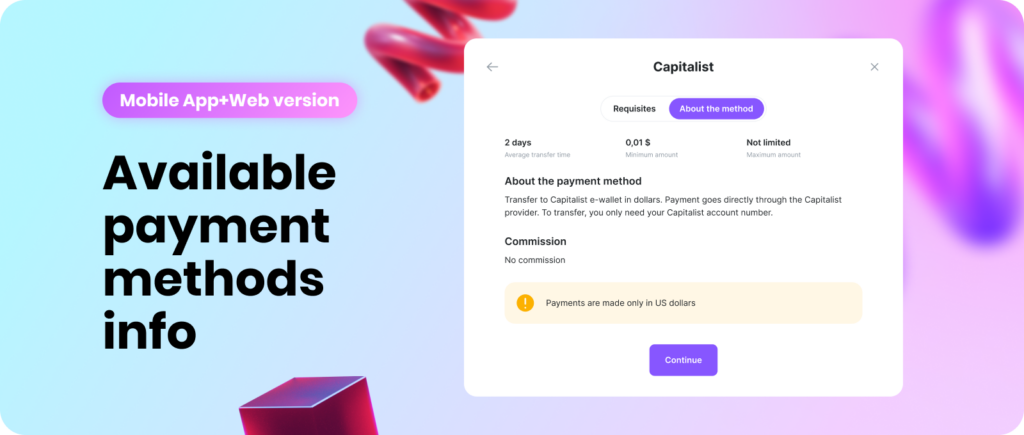
Now, the users who have passed the KYC and have a balance of </= $0, while clicking on the “Withdraw” button, will see all the payment methods and will be able to view information about them. Anyway, the “Details” tab will still be limited until the balance will be more than $0.
“What’s new” in MC Pay:
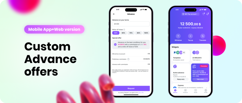
We emphasized that this is not just an offer, but a promotional one, which can disappear at any moment. That’s why the advantage should be taken as soon as possible.
Custom offers are now also available to users with an active Advance. When the user has a Custom offer, we display only it in the Advance calculator, hiding ready-made offers.
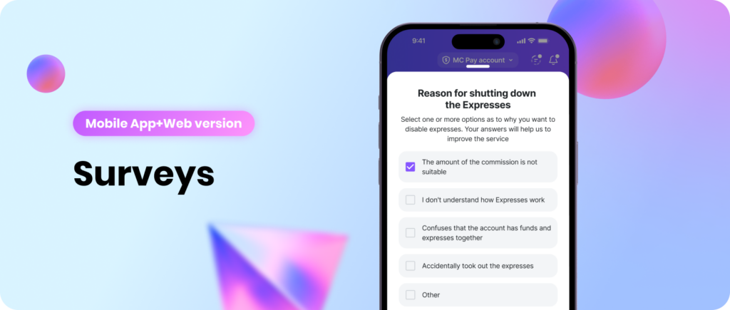
When Expresses are disabled and the Advance is successfully repaid, we will collect feedback from users in the form of small surveys in order to further develop the product based on the data collected. That way we’ll know exactly what’s worth working on in the next updates.
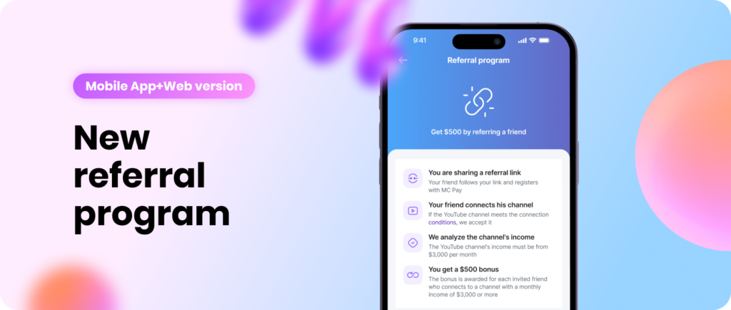
We are proud to introduce a new feature that our users are sure to love. Each user will have a unique link generated, via which they can invite other creators to the network. After successfully connecting a channel with an income of $3,000 or more, the user who invited this channel will be paid a $500 bonus.
To receive the bonus, the user must meet the following conditions:
1) A request from this channel should not previously be in the system.
2) The request must be successfully accepted and transferred to the “Connected” status.
3) The decision to pay a bonus must be made by the manager.
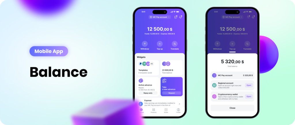
We reconsidered the approach to the main screen of the app.
Previously, this was a screen with a list of all accounts, but practice has shown that users mainly use only one account, so switching accounts went into a block with a general MC Pay balance, compactly located next to the templates.
Also, taking into account the new block format, we have collected all the important things literally on one screen, concentrating all the user’s attention on fintech products and interaction with them.
The main screen has been optimized in terms of advertising content: everything has become clearer and more manageable.
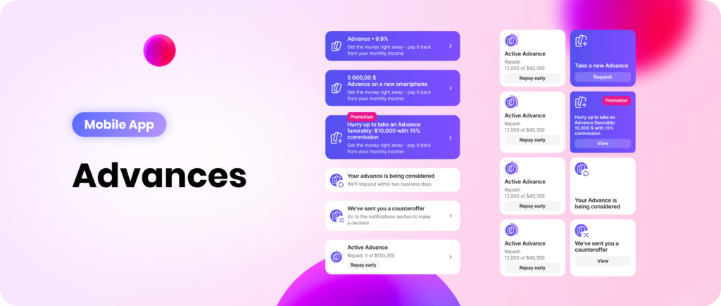
In the interface, we divided the active Advance and the opportunity to take a new one, with the corresponding CTAs: repaying the current Advance and requesting a new one. We also improved the system for displaying personal offers to users, highlighting its uniqueness in comparison with other Advance offers.
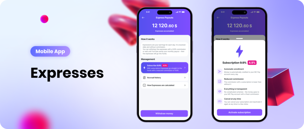
At the moment, Express Payout is a very complex product, which, in addition to complex calculations, includes many terms that are difficult to understand even after using the product for a long time.
We simplified the naming, reduced everything to Expresses, which are already used in our work. Now they are both the name of the feature and the old Credits. We rewrote the interface texts according to all this.
The interface itself has also been redesigned, so now everything related to Expresses — the logic of operation, the history of crediting, the available amount of Expresses for withdrawal, the amount of credited Expresses for the current month — everything is now in one place.
The feature is now called “Expresses”. You can simply enable Expresses, or you can enable a subscription.
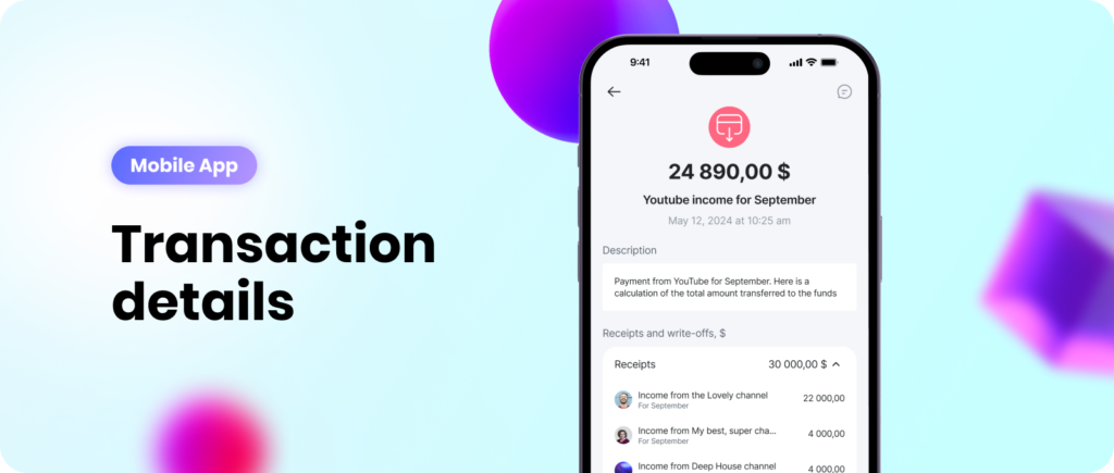
We visually changed all transactions and additionally improved the structure of transactions, where there is a breakdown by channel:
Now when you open the details, everything is divided into categories: Receipts/Taxes/Deductions and total by category. Expanding a category reveals more detailed statistics.
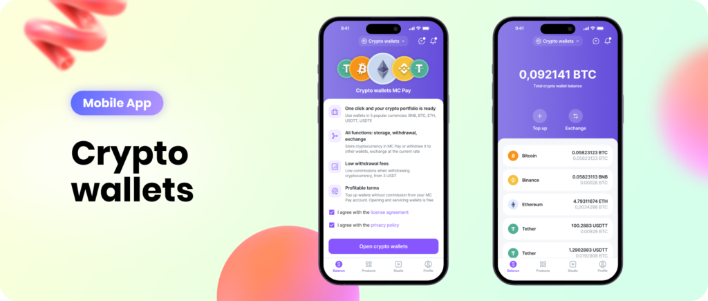
We have updated the crypto wallets page in accordance with the new screen style: the changes affected both the promo page and the pages of the general balance and specific currencies.
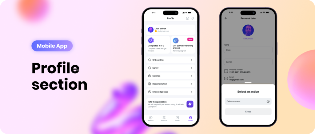
“Achievements” button: now the end-to-end element with achievements is located in the Profile section.
The “logout” button: previously, to log out of your account, you had to wander through the settings. Now this button is located in a logical place — the block with the avatar.
Deleting an account has become more difficult: account deletion was hidden under three dots in order to minimize the risk of accidental deletion.
Referral program: the new referral program will be located in the Profile section.

The Studio section has also been modified in accordance with the new screen style: the changes have affected the channel cards, now they have a brighter background. A hideable banner has been added that reminds users to connect a channel, as well as a button at the end of the channel list.
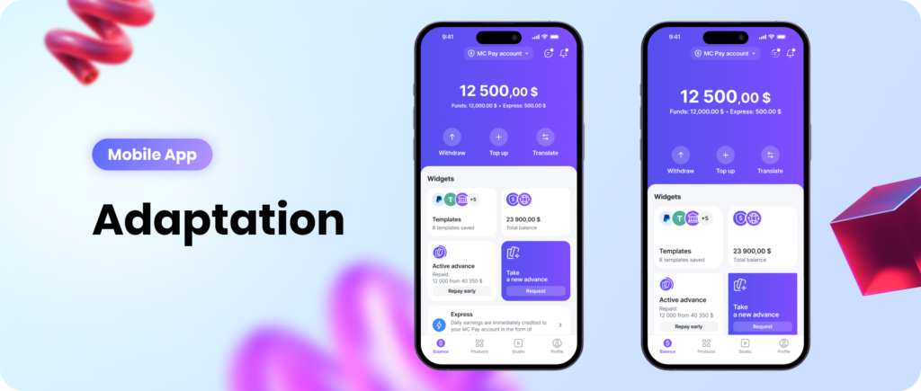
Previously, the MC Pay app simply stretched on the big screen. And now all blocks, sizes and indents are calculated using a formula and displayed proportionally to each other.
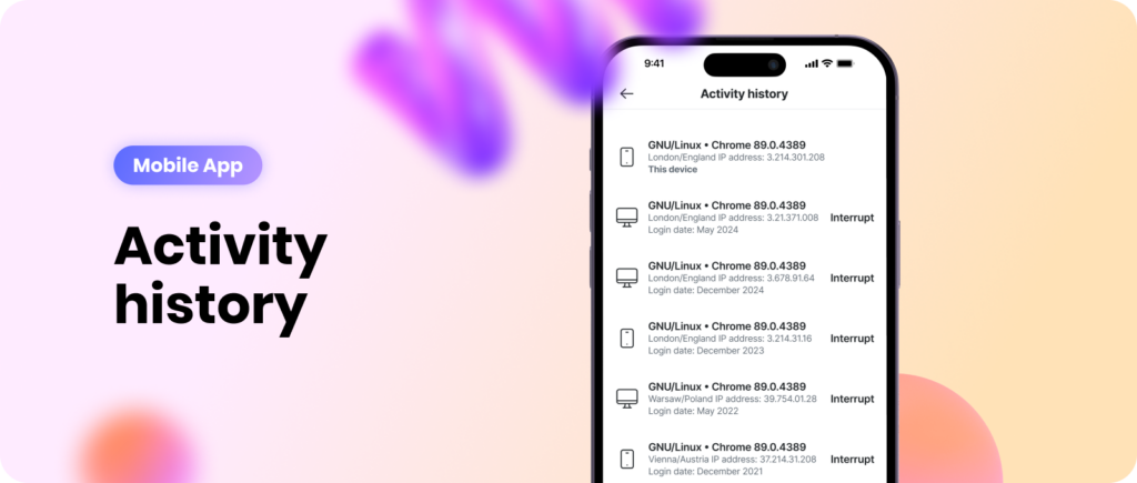
We corrected the activity history so that data about the location and browser are displayed.
Despite the rapid development of our mobile app, we never forget about improving the web version of the service.

We have added a new item to the MC Pay menu. When you click on it, a window will open with information on how to download the app.
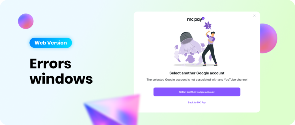
Previously, when a user tried to connect a channel and selected a Google account on which they did not have a channel created, or when errors occurred on the Google side during the connection process, they were not informed about the error and were transferred to the initial stage. Now there are 2 windows informing about problems depending on the situation.

Now, when sending messages,they will pop up in the interface as “toast” notifications which attract user attention and increase user engagement in communication within the app.
We agree with you: the update is large-scale and quite exciting. Nevertheless, we do not plan to rest on our laurels and are improving our services on a daily basis. Therefore, we will be waiting for your feedback on our new features with gratitude.
Regards,
Mediacube team
Comments