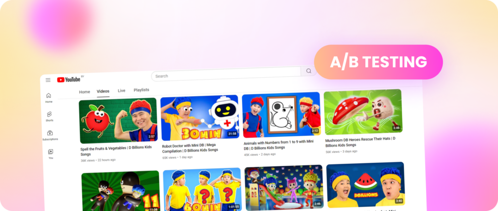
It may seem weird, but not long ago, the community raised the issue of thumbnails no longer playing an important role in video promotion. It all started with MrBeast’s interview with the TubeBuddy channel, where he expressed this opinion, justifying it with the introduction of the inline player, on which videos (primarily on mobile devices) start automatically, and therefore more attention should be paid to the first seconds of the video.

But we think Jimmy was too hasty in his conclusions.
Table of Contents
There’s no need to be a great linguist to understand where the word ‘thumbnail’ comes from: at the very beginning of YouTube, thumbnails were literally the size of a thumbnail. But since then, the images have grown larger, and creating thumbnails has become a true art that is evolving literally every day.
And MrBeast himself is rightfully considered one of the most meticulous creators in this area. Remember the story when he found out that thumbnails with a closed mouth bring more views than with an open one? By the way, he came to this conclusion using the A/B testing tool that YouTube now offers, but we’ll get back to it later.
So do thumbnails really not matter that much anymore?
Of course they matter. It’s just that with the introduction of auto-play, good video performance began to rest on three pillars: the thumbnail, the title, and the first 5 seconds of the video. Thumbnails still remain one of the key factors in attracting the viewer’s attention, so no matter what anyone says or what new features appear on YouTube, this aspect is unlikely to change.

Last year, the platform gave creators access to a feature that automatically checks the popularity of thumbnails. How does it work?
You upload a thumbnail, click on the three dots and go to the “Test and compare” section. There, you have the opportunity to upload up to three images that YouTube will show to different groups of users and, based on their reaction, will tell you which thumbnail performed best.
You could say that YouTube has literally given creators a ton of free time, because before, this work had to be done manually. You uploaded a video and then spent an hour or two watching how the views were going. If you weren’t happy with the results, you changed the thumbnail hoping that it would work better and attract more attention. Now all this happens automatically, and all you have to do is relax and enjoy (of course, considering that you had to draw three separate thumbnails first).
By the way, our Head of YouTube Analyst Lesha Zalozhuk recently gave some important tips on how to use A/B testing correctly:
1. Don’t make 3 identical video thumbnails at the time of publication. Changing colors or text, zooming in on objects, etc., won’t make a big difference. Your thumbnails will have roughly the same metrics 90% of the time.
2. It’s better to test three radically different options. In our content localizations, we took an already successful original thumbnail, then modified it according to current trends and separately created new designs. In most cases, old but successful thumbnails lost to new ones, leading to a fresh influx of audience and even more views.
3. When you have a winning variant, you can also conduct crazy and niche tests with this thumbnail, like changing colors, certain triggers, or text. It helps to understand what might perform even better with the audience. Remember, our goal is to sell the video, and this is what we need to do.
4. Experiment. Don’t spare resources on crazy initiatives, even those thumbnails that might seem strange to you. No one knows the exact formula for a successful thumbnail, and often the one you wouldn’t have chosen can win. This is because in your worldview and experience, you might overlook micro-trends that can be used.

Actually, it is almost impossible to answer this question. As we said at the very beginning, the approach to thumbnails changes daily, creators experiment, learn from mistakes, change approaches, and start over. But the main trend of recent years, which can definitely be called the decisive factor, is the quality of the image.
Today, you can no longer release a video with a still frame from a video on the cover and hope that an inexperienced viewer will immediately click on it and watch it to the end. Even if your content is three times top-notch, the YouTube algorithm won’t even pay attention to it, and it will drown in the dark and cold basements of the platform with views only from your family members.
There are a great many guides on how to create high-quality thumbnails, but almost all of them come down to basic things:

Do you hesitate using templates? Don’t, because they can be very useful, especially at the first stage, when you have not yet fully mastered all the intricacies of thumbnail kung fu. Here are some platforms that might help you.

Experience shows that everything comes with practice, and this too. Track your competitors, learn from their experience, constantly develop, use all available tools, and study your audience. There are no trifles in this matter, and if you understand what it takes to create an attractive thumbnail, do not stop there. Because the best thumbnail is the one you haven’t drawn yet!
Good luck!
Comments